Monthly Archives: February 2013

Learning Task 6

Today’s Activity involves isolating and collating examples of white space in advertising. I chose the following examples of white space to illustrate my understanding of the concept in the following genre

1. Print publishing, magazines or newspapers
2. Street advertising or shop frontage
3. A Billboard
4. A Website
5. Broadcast TV

img005

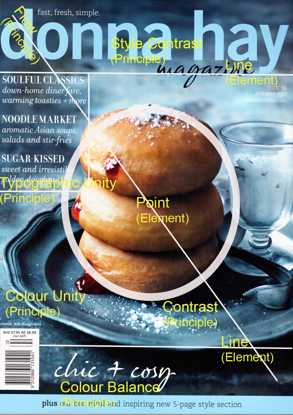
1. This advertisment came from a Donna Hay magazine (I took the photograph) and I chose it because I like how the red of the tomatoes is balanced out with the green of the leaves and the white space surrounding the images and behind the text mellows out the bright colours and makes this advertisment very inviting to look at

DSCF9696

2. This photo of Shop Front advertising uses the paintwork on the building and the sides of the lettering as white space to ensure that the lettering stands out and is very visible from all angles.

DSCF9659

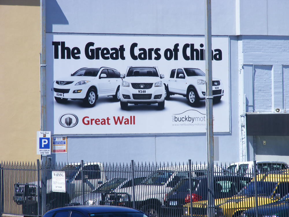
3. I chose this example of a billboard where the predominate colour used is white. The white space surrounds the image and text/logo and is reflected in the colour of the cars to give a very homogenous seamless look to the shot

white examiner

4. This screen shot comes from http://www.examiner.com.au/. I chose it because it illustrates how text and images increase in visual impact against a white space background. A small amount of colour goes a long way when a large expanse of white space has been used

DSCF9833

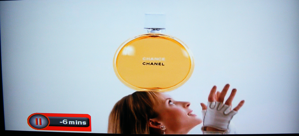
5. The white space in this photo surrounds the image of the large perfume bottle and the model and highlights the product.

Leave a comment

Filed under Uncategorized

Learning Task 5

For this activity I needed to find a graphic that illustrated the use of Negative Space in each of the following catagories…

1…Magazine, Comic or Newspaper
2…Web
3…Architecture
4…Natural Environment
5…Street Signs
6…Vehicle Signs
7…Film
8…Broadcast
9…Automotive design
10..Human Anatomy

Comic

Calvinhobbesnegativespace comic

I got this image from http://www.littlewolfblog.com and really liked how the use of orange and white negative space bring the characters into stark relief

Web

Negativespacewebsitebillbailey.co.uk

I really love http://www.billbailey.com because aside from it being a fantastic interactive site, it uses negative space well by framing the site and highlighting Bill’s mug shot and the central blue text.

Architecture

Negative space architecture MorgueFile

I got this image from http://www.morguefile.com/archive a free online image site. I like how the sky and the mirrored buildings act as negative space for the cream and white buildings in the centre of the photo

Natural Environment

MorgueFile negative space nature

This image was sourced from http://www.morguefile.com/archive and I liked the use of the grey background (negative space) to accent the water droplets on the spiders web

Street Sign

Negative space archi morgueFile

I obtained this image from http://www.morguefile.com/archive . The night sky/darkness acts as negative space for the illuminated signs

Vehicle Sign

vehicle sign negative space morgueFile

This image came from http://www.morguefile.com/archive and shows an illuminated bike against black negative space

Film

negativeimage film gibff.net

I guess this is a bit of a grey area where negative space bleeds into white space. There is negative space under the film strip (the shadow) along with negative space inside the strip where the black brings the white and grey areas into strong relief. I got this image from http://gibff.net/?p=9

Broadcast

SIS_01_Logo_Kopiewww.live-production.tv

SIS is a tiny broadcast network in London that acted as an intermediary for other world networks when the 2012 London Olympics were occuring. I chose it because the red background acts as negative space. I got the image from http://www.live-production.tv/news/sports/support-broadcasters-london-olympics.html

Automotive Design

2003VWBeetlenegativespace

This image of a VW Beetle came from http://www.netcarshow.com/volkswagen/2003-beetle_last_edition/1024×768/wallpaper_06.htm . I wanted to choose something quirky and it is interesting to note that the grey area immediately surrounding the beetle is acting as negative space whilst at the same time using white space to focus the viewers eye on the beetle.

Human Anatomy

Processed by: Helicon Filter;

I loved this photo. I got it from http://www.morguefile.com/archive . Black negative space has been employed to highlight and focus our view on the man’s face and hand.

An I in team

A good use of negative space IMHO 😉

Leave a comment

Filed under Uncategorized

Learning Activity 4

I chose to use Photoshop to complete this activity. It is somewhat difficult to see the highlighted areas where I wanted to illustrate Tension Points so I have included the 2 images here to make them easier to see.

Learning Task 4 tension added

The top squares illustrate how you can use squares (in white or black) to give an impression of a concept. The concepts to be illustrated are “Order”, “Increase”, “Bold”, “Congested”, “Tension” and
“Playful”. I then chose my favourite illustration from each of the 6 titles to place into one of the lower boxes

b1 tension

The Tension Point in “Bold 1”

c3 tension

The Tension Points in “Congested 3” including the pointed edges of the black boxes in stark contrast to the white background directing your eye to this area and the broken area of white in between the boxes that directs your eye to this area

Leave a comment

Filed under Uncategorized

Learning Task 3

Hopefully I got a few of these right 😉

Learning Task 3

Leave a comment

Filed under Uncategorized

Learning Task 2.

A pretty straight forward magazine cover

DSCF9744

Leave a comment

Filed under Uncategorized