Final assessment in Prepress

For my final assessment in prepress I was given 3 tasks to do. The first task involved creating an 8 page booklet on a range of subject matter. I chose colour theory and created the following pdf document…

Colour Theory F

I was then asked to create a logo for an internet cafe called “Wired with One”. I thought about it a lot and decided to use all typography to create a very simple but effective logo that could be used on a wide variety of surfaces in all of the major colour model ranges. Here is what I came up with…

logo_RGB


The last part of this assessment was another 8 page booklet that was all about the Do’s and Don’ts of Typography. I created all of my own illustrations for both the first book and this one and here are my efforts in pdf format…

Typography Dos and Don’ts

Leave a comment

Filed under Uncategorized

Prepress LA04

This task needed me to create a car advertisement out of a selection of text, images and a logo that I had to include in the result. I had to create artwork in Illustrator to accompany and enhance my document. Here is my result

Quiggleys Quality F


Leave a comment

Filed under Uncategorized

Prepress LA03 Photography hints and tips mini booklet

For this task I had to create a mini booklet by rewording a selection of tutorials (my choice of 5) from a series of tutorials on a website. I then had to find images that I had taken that would illustrate these tutorials and create a (more than 2 column) mini booklet in InDesign to show these tutorials and images off to my best ability. I had to consider the text that I would use (I chose Bauhaus 93 and Fecske as they are both Art Nouveau typefaces that complement each other), I had to think whether I would use drop caps (which I did) and about the layout etc. It was pretty hard to fill 8 pages (the required amount of pages) with text as the more columns that you use the smaller the text had to be. I ended up adding a few images and some extra text at the end of my booklet because I ran out of tutorials and images. Hopefully it ties together well. I then had to turn the InDesign document into a pdf and then into an 8 page Photoshop imposition. Here are my results

compositionF1re

And here are two images of the final result turned into an imposition in Photoshop. An imposition means that the document is ready to print out and be turned into an 8 page booklet

PartB Imposition F PartB Imposition F 2


Leave a comment

Filed under Uncategorized

Prepress LA02 Creating a Graphic Design Map

For the second part of Prepress that I started when I finished my Technology final assessment, I had to recreate a Graphic Design Map from a map produced for  the Australian Graphic Design Association (AGDA). The original looked like this…

AGDA Graphic Design Map Original

AGDA Graphic Design Map Original

I created my version in Illustrator using the idea of a rainbow because I thought that this was a very boring map. My appologies to the creator but I like bright colours. Here is my recreated Graphic Design Map

Much brighter :)

Much brighter 🙂

Leave a comment

Filed under Uncategorized

Final Assessment in Technology 03

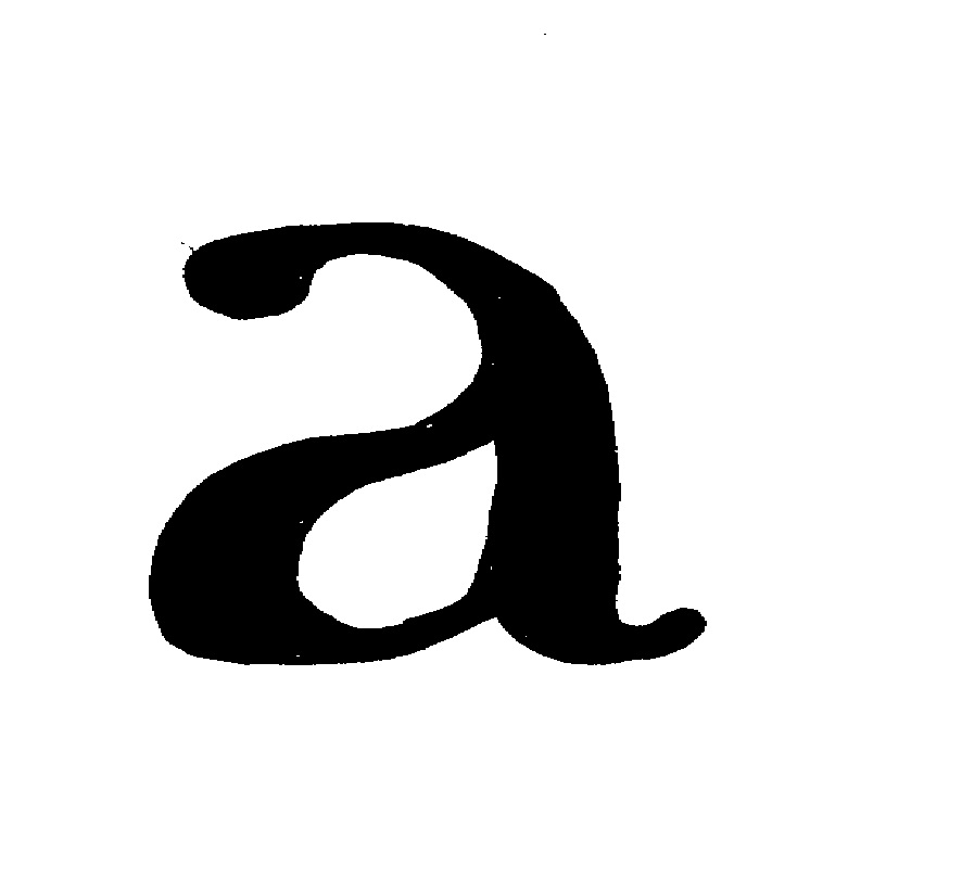
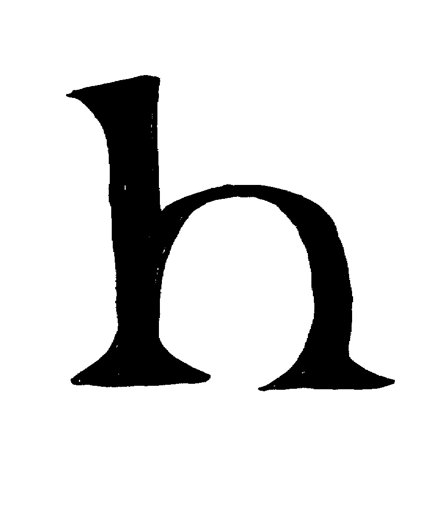
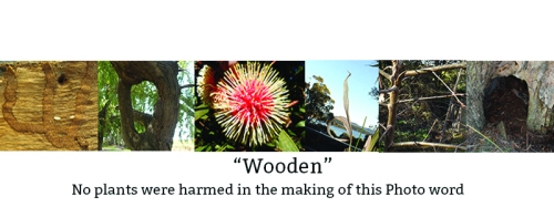
The final assessment consisted of 4 parts. For the first part I had to create a word out of photos of  letters created naturally in angles and shapes found in nature or architecture etc. The letters couldn’t be actual letters and I wasn’t allowed to form them (i.e. create a letter “L” out of stones) so this made it a bit more challenging. Here is my result

WordF

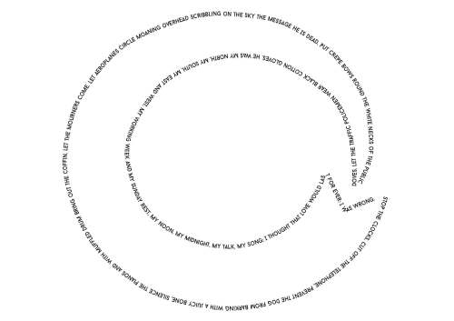
The next part required me to find a speech or nursery rhyme, draw a shape in Illustrator and then use the “Type on a Path” tool to create a story in text alone. I used the speech from four weddings and a funeral because I really loved it. The poem quoted was called “Funeral Blues” by W. H. Auden an Anglo-American poet. I wanted my shape to be simple but it had to reflect eternal love and loss/death so I chose to use a Celtic symbol for eternal life, a snake/dragon swallowing it’s tail. Here is my simplified Celtic result

SpeechF

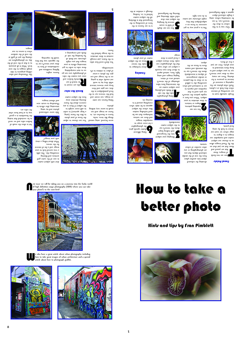
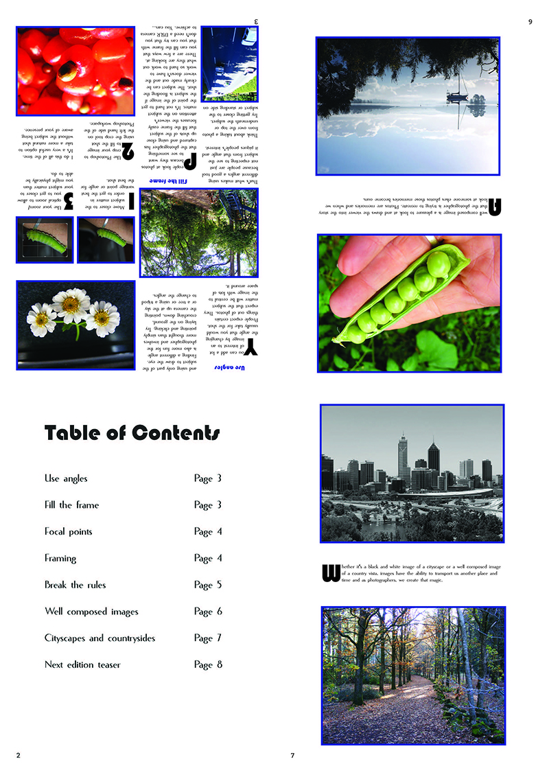
The next part of this assignment was hard work. I had to create a series of tutorials for how to use tools in the Adobe suite. I wasn’t overly familiar with quite a few of them so I was learning on the fly. I had to create images to accompany the tutorials and then collate the tutorials and images into InDesign where I turned them into a magazine with a front cover and rear cover and contents page. I then had to export the document to a pdf and turn the pdf into an interactive pdf with bookmarks and links. Here is my result

Adobe Plus F

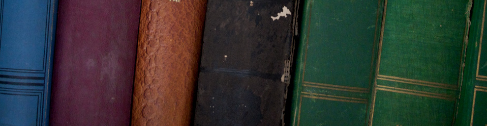
The last part of the assessment was to create a photobook out of 4 images that I had to take of the same thing taken in different angles. I used a hatbox full of bright satin ribbons. I then had to take 3 original photos, scan them in three different ways (1 colour in 300 dpi, one grey scale and one line art) and collect the metadata from all 7 images. I then had to create a collage out of all 7 images and turn the results into a photobook which I then had to convert to an interactive pdf with bookmarks. Here is my result

Photobook F


Leave a comment

Filed under Uncategorized

Sustainability in Design

I had to produce a series of word documents answering a series of questions about sustainability in the workplace. Although this was quite long winded and research intensive I got a break here and there where I could create a couple of posters. One was created as a poster to teach primary aged students about how to save energy and the other poster was a workplace poster about saving water. Here is what I came up with

LA 01 Australian Paper Video F

LA 02 Sustainability F

LA 03 Marketing F

The task above required me to make an energy efficiency poster aimed at primary school students. Here is what I came up with. I tried to make it bright and game like in order to engage them…

Poster F

LA 04 Regulators F

LA 05 Information F

LA 06 Resource Audit F

LA 07 Stakeholders F

LA 08 Checklist F

LA 09 Water-poster F

Here is the water wise poster for a workplace that I came up with…

LA 09 Water-PosterF

LA 10 Triple Bottom Line F

LA 11 Monitor targets F

Leave a comment

Filed under Uncategorized

Scanner Guide

I had to create a guide for a scanner in this task. I had to use InDesign to create this guide. Here is what I came up with in pdf format

guide Fredo

Leave a comment

Filed under Uncategorized

Hand drawing letters in a font

For this task I had to find a font that I liked and reproduce 6 letters that showed how this typeface was different to others. I chose Baskerville Old as my typeface and here are the letters that I reproduced that I felt were indicative of this font

hand-type01 hand-type02 hand-type03 hand-type04 hand-type05 hand-type06

Leave a comment

Filed under Uncategorized

Type Families

I had to recreate a selection of text in 5 different fonts (that were supplied). Here are my results in pdf format

HelveticaF

GaramondF

CenturyF

BodiniF

BaskervilleF


Leave a comment

Filed under Uncategorized

Mid Year Design 3 Final Assessment Part 2

The second part of this assessment was for me to come up with a postcard concept, front and back. I was asked to proof read and ammend a selection of text. It wasn’t entirely clear as to whether or not I was supposed to add the text to the postcard so I added it anyway just to be sure. I was asked to use the idea “Colours of Austalia” as my starting point and to include this somewhere on the front of the postcard. Here is what I came up with. This is the front of the postcard…

Postcard F_Page_1


And this is the rear of the postcard. I thought that it would be a good idea to recreate the artwork on the front of the postcard on the rear of the card but opaque and without the strong stroke. I liked how this turned out

Postcard F_Page_2

Leave a comment

Filed under Uncategorized